

I have been teaching Data Visualization for a while now. One of the many reasons I loved training is that my thoughts are structured further and I get to practice on how to bring across learning points so that my participants can understand and apply effectively into their data work.
In this post, I will like to share some tips on creating insightful visualizations which can be graphs or charts. Just to be clear, I am not sharing how to build nice info-graphics. I am not a big fan of it. The reason is the audience gets "wow-ed" initially with the nice graphics (not the charts) and the attention dies down almost immediately. The audience does not gained many insights from it. To be fair, this is based on my observations so there might be black swans out there. :)
Tip Number 1: Start with Business Questions
Readers of my blog will have known that I am a STRONG believer that data projects should provide value, value that exceeds costs. What determines the value of any projects, including visualizations? The BUSINESS QUESTION!
State down firstly, the ONE business question you want to get answered with the single visualization. Step two is to write down a list of questions that your audience may ask. Step two comes with having empathy, putting yourself in your audience's shoes. It takes a lot of practice to anticipate the questions well, so practice more! :)
Given the current development of tools, gone are the days where we have to go to and fro between Excel and Power-point. We now have suitable visualization tools that help us to build visualizations, answering a plethora of questions the audience may ask.
What tools can you use? There are a few of them like Tableau (free if public version). Power BI (free, so far) and if your infrastructure is on Google Cloud Platform (GCP for short), you can try Data Studio.
The business question ultimately will determine the value of your presentation, the value you are giving back to your employer.
Tip Number 2: Design on Paper first
With the business question in mind, you can design the visualization on paper first. To NOT let your tools restrict your creativity and design. To help with the designing phase, I strongly recommend you follow the visual vocabulary that is provided out there. Here is a version provided by Tableau (here) and an expanded version of Tableau's provided by Financial Times (here).
From your business question, ask yourself which visual vocabulary is the most suitable one. At the start, while learning this thought process, you are likely to stumble but my advice is, Practice Makes Perfect.
After determining the visual vocabulary, you have scoped down to a few suitable visualizations you can use, for instance if its Change Over Time, then its either line, slope, area, etc. Select the one that you feel can answer THE business question.
After designing it on paper and you are satisfied that it meets the 3-second rule (more on this later), it is time to look at the list of questions that you have prepared and ask what other data can you put in to answer those anticipated questions. Design this part into the visualization on paper first. Let us have an example here. Below is the number of crimes reported for each Police District in San Francisco. Data Source is from Kaggle and Tableau is used.
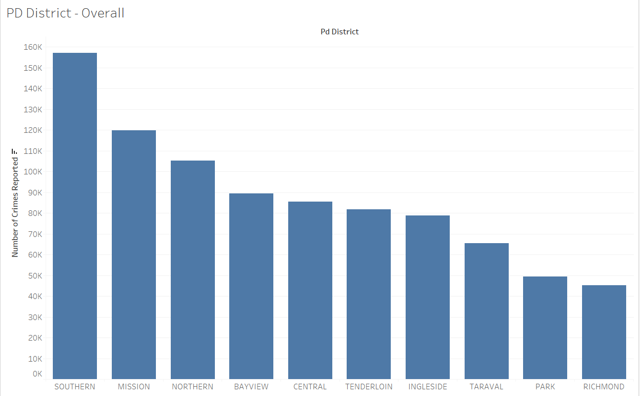
Anyone who looks at it will have a few questions (if they are mature in data analysis) and that is "What is the proportion of crime for each district?". You can then add in the percentage total for each district.
Side note: you notice that as you move further to the right, your audience always has to look from left to right to get the actual number of crimes reported? Just look at Richmond (far right) and tell me how much crime reported. Do your audience a favor. Add in the number of crimes for each PD district and format your numbers well. Your audience does not need to know the exact, but they want to have a good estimate of it. See below, with the improvement.
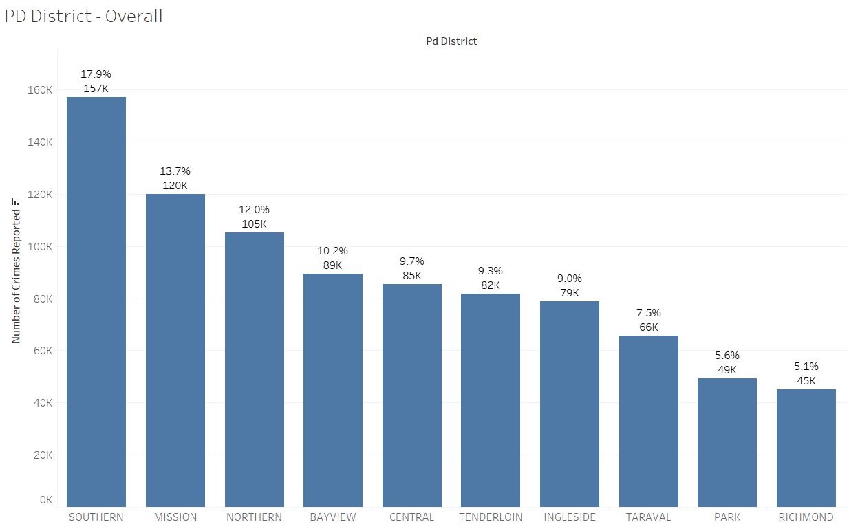
You can see the improvement is not a lot but you have put more information in your audience's hands to draw their conclusion. Your audience can now easily compare the Police Districts.
After you are satisfied with the design on paper, it is time to create them in your available tools. It can get frustrating at times and you will realize that your tools do have limitations. What you can do is remember these frustrations as learning points. You can either share them with the software provider or keep in mind for the next tool review. :)
Tip Number 3: 3-Second Rule
This one is pretty straightforward. 3-Second Rule means that your audience should KNOW the ONE insight you want to share in your visual and the realization happens within 3 seconds! If not, you have FAILED! Please re-design it.
For instance, let's say I want to answer the question, "Which PD district has experienced a drop in crime?" and I showed the following.
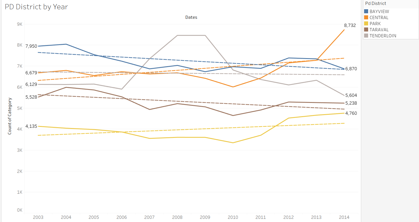
You can see that the above visual is quite cluttered and the audience will not find it easy to determine which Police District did experience a drop in crime. The reason is the audience has to compare two numbers that are found on the opposite end of each line, making it more difficult for comparison.
Versus this one over here.
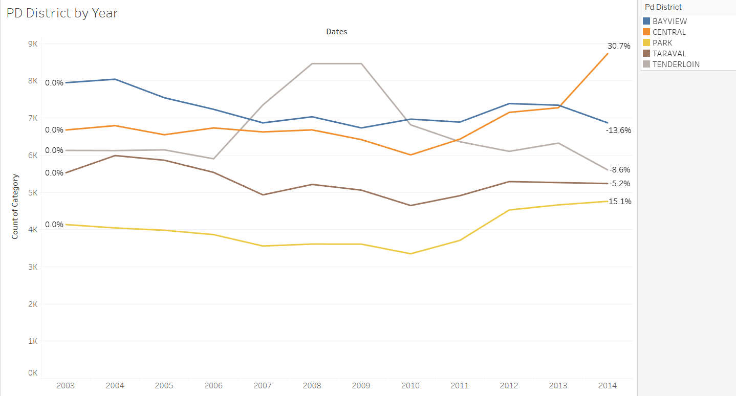
1-second to see all the zero percentages on the left for the basis of comparison and on the right-hand side, using 2 seconds to see if any percentage that is negative, which means that the PD experienced a drop in crime reported between the start and end.
Another way of testing the 3-second rule is to build your visualization, and come back to it 1-2 weeks later, where your mind has been occupied with other work. If the visualization, after a hiatus and still within 3 seconds tells you what you wanted to show back then, congratulations you made it! :)
Tip Number 4: Never Ever Clutter!
This is related to the list of anticipated questions. As much as possible we will like to have one single visualization answer ALL business questions but that is never realistic. My experience so far is that a single visualization can answer about 3 or 4 different questions. Anything more will mean that the visualization is getting very cluttered and cluttered visuals is a HUGE NO because it breaks the 3-second rule.
Never clutter the visualization because your audience will lose focus. Losing focus means that the insights you want to present never stand out and you can lose the audience's attention and confidence very quickly.
Most tools these days have the undo and redo function to help you test out the look and feel before and after a modification. Take advantage of it! :)
Conclusion
Here are a few tips I use to help with designing good visualization. I am sure there are more and I will share them with you once I come across them. Meanwhile I hope these are useful. At the end of the day, I just want to say, it is not possible to get it right the first time so practice does make perfect when it comes to building good visualization.
Have fun in the data science and artificial intelligence learning journey. If what I provided is useful and you want to stay connected, do sign up for my newsletter, look me up on LinkedIn and perhaps follow me on Twitter.