

Most of us have sat through bad presentations and data visualizations that make us cringed and scratched our heads, wondering what the visualization is trying to "share". And we tolerate bad visualization time and again, spending precious meeting minutes on trying to understand what the visualization is saying rather than starting a thought process from the insights it is supposed to present.
What makes it worst is that most of the training curriculum I have come across, not many of them teach data visualization. I figure the common understanding is that data visualization does not have an aura of complexity compared to machine learning, ie. data visualization is not as sexy as machine learning.
Think about it, if data visualization is easy, most of us need not sit through those bad data visualization at all. So I can conclude data visualization is not easy at all.
I have been teaching data visualization for a few years, I felt that to be able to come up with good data visualization takes practice. It also takes a lot of time as well. In this post, I am going to what one needs to come up with good data visualization.
Good Data Visualization
Good data visualization, like what my friend says, must give you the "aha" moment immediately! Good visualization shortens the time between the slide presented to knowing what the insight is. I have this 3-second rule. If the audience does not get the insight after the visualization is presented for 3 seconds, then the visualization is badly designed. Back to the drawing board. Good data visualization also helps to provides additional context around the insight for better decision making. So what is needed to come up with good data visualization?
Planning
First thing, plan your presentation. Know who your target audience is first so that you know what matters to them the most and what information will they need to make better decisions. Another thing to find out is what is their visual literacy level, meaning what kind of graphs/visual do they understand. Do they know how to read a treemap or heat map? Knowing what kind of graphs they know how to read, helps you to layout your visualizations better. One suggestion is do not keep sticking to familiar visuals. Try to add in one or two visuals that the audience does not know how to read but it is appropriate for the specific presentation/analysis. This can up their visual level and allows you to have more visual tools at your disposal.
Design Thinking
Good data visualizations require design thinking as well. the reason is that for some business questions we may need to put together several dimensions (columns) for analysis. How to put those dimensions together into a useful visualization needs design thinking. For example, to facilitate comparison we may need to use length as a visual cue and put certain bars side-by-side, or shall we sort the bars by length so that the visual can answer the question quickly.
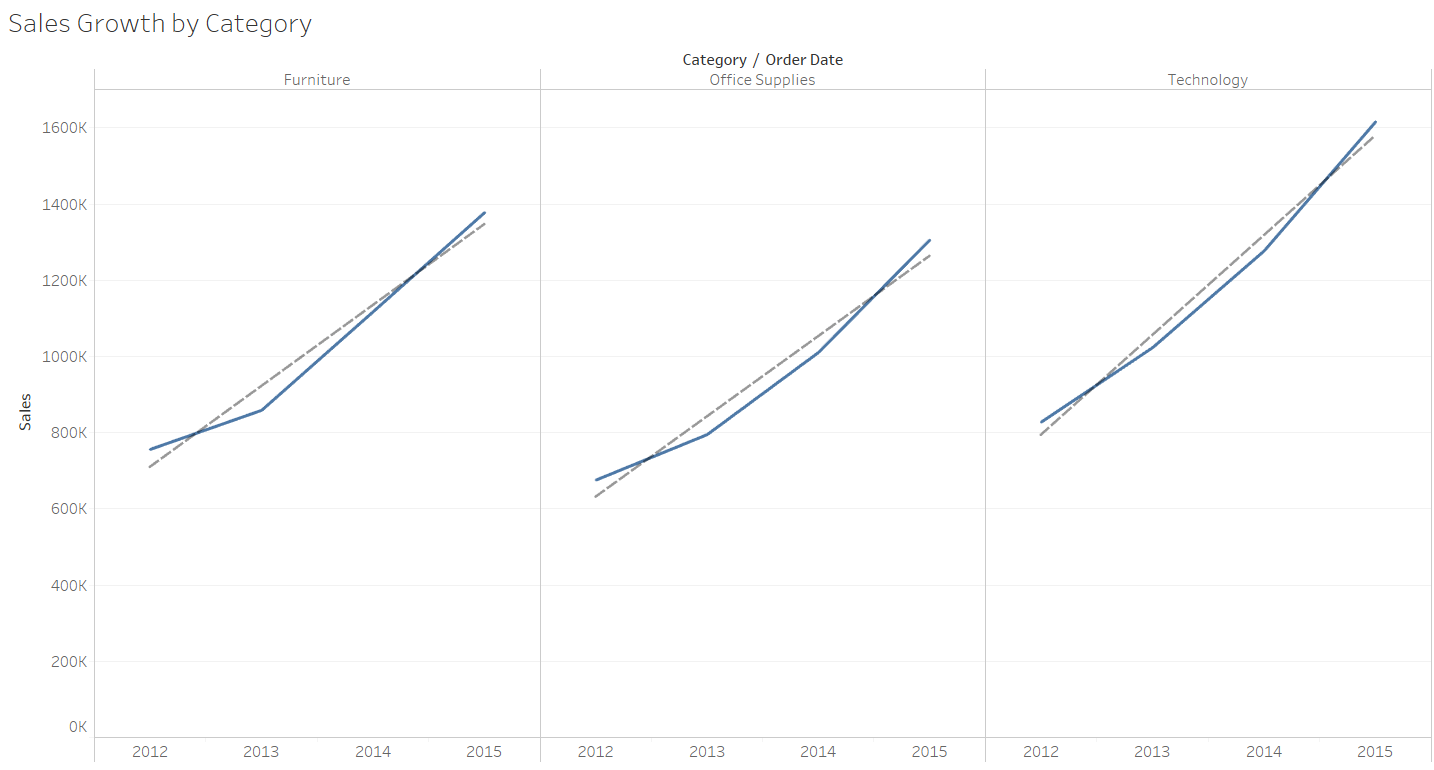
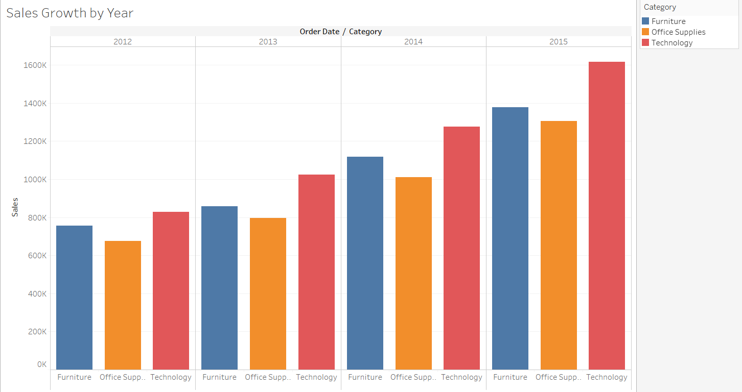
For instance, Figure 1 below can answer the question, "Which category experience growth in sales?" whereas with the same information but presented in a different manner (Figure 2), it is easier to answer the question, "Which category contributes the highest sales for each year?"
Another thing is to provide useful context for our visualization. How to put the context together with the insights, in the visualization requires design thinking. My suggestion is to pay attention to the questions that your audience asks. Take note of the common questions us because those are the ones that matter to them the most. once you get hold of the common questions, they will provide direction on how to put your visualization into a good context. A good context can help answer several secondary questions related to the insights.
Empathy
If we are to create visualizations that our audience understands, we need to put ourselves in their shoes. What are they likely to see and focus on in the visualization? This requires empathy. What they immediately focus on allows us, the presenter, to provide a more cohesive data story to share. You can see that Empathy is needed both in Planning and Design Thinking. :)
Conclusion
Coming up with good data visualization is not easy, granted it does not have the Greek symbols or mathematical formulas behind, but it taps onto different faculties of our brain. But if we want to get rid of the scourge of bad visualization, it is time we spend more time and practice creating good visualization, one that makes an impact on business by effectively and efficiently sharing the insights needed to make better business decisions.
Have fun in the data science and artificial intelligence learning journey. If what I provided is useful and you want to stay connected, do sign up for my newsletter, look me up on LinkedIn and perhaps follow me on Twitter. Please share if you find this article useful. :)