
Continuing from my previous post on the calculations to do when conducting Exploratory Data Analysis, in this blog post, I am going to discuss how to use visual to explore our data better.
To reiterate here, the two main benefits of doing a good EDA is:
- Have a good understanding of data quality. We need high quality data to build good models. I told most of my students and trainees that data is never clean. We only get it to a quality level that we can use.
- Gain some quick insights into the project. Understand what are the potential drivers for supervised learning or possible patterns. These insights can be quick-wins to get more buy-in from other stakeholders.
Assumptions: In this discussion, I am assuming that the readers have some background on variables (understand what is Categorical Variable or Continuous Variable) and basic summary statistics such as mean, median, mode and statistical distributions.
In the visual exploration of the data, there are two things we are looking at:
1 — Distribution of values in a single variable.
2 — Relationship between two variables.
1 — Distribution of Values in a SINGLE Variable
Categorical Variable
To explore a categorical variable, we can plot a frequency bar chart.
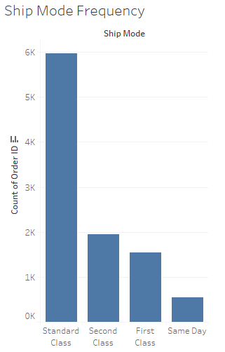
So when we are exploring a single categorical variable, we are looking for the following:
a. What is the most popular and least popular category?
b. Are there any values that is not expected to be there?
c. Is any frequency of certain categories seems lower/higher than expected?
d. Is there any categorical value that is not supposed to be there?
The questions are meant to check for data quality and if the data can be “trusted” to reflect the reality.
Continuous Variable
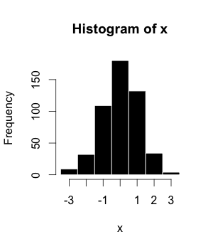
Histogram is the visual that I use to understand the distribution of continuous variable. Before one attempts to create the histogram, the continuous variables need to be binned first (i.e. create bins). For instance, age is continuous and we can bin it into 0–5, 5–10, 10–15… Once we bin it, we plot the frequency of the underlying value in the bin.
There is an art and science to binning actually, and if you do not set the bin’s width carefully, you can missed out important information. For instance, when the bin width is smaller, the distribution may show to be bi-modal (2 or more modes) but when the bin width is large, it becomes single-modal. Thus choose your bin width carefully and preferably start from a smaller bin width.
From the visual, we are looking at the skew-ness and kurtosis. The skew-ness is very important especially if you are going to use it as a feature or target for your regression models, as there is an assumption that the features and target is normally distributed to get BLUE (Best Linear Unbiased Estimate) of the coefficient/parameters. Doing the histogram, allows for better planning of data cleaning later on.
2 — Relationship Between Two Variables
Categorical vs Categorical
To understand the relationship between two categorical variables, meaning which unique groups has the largest size, we can use a heat-map with each categorical variable as the rows and columns and the frequency of each group represented by the size of the rectangle or square. Example below:
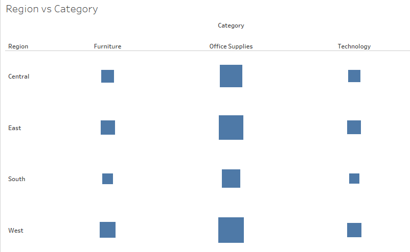
The questions that you asked about heat-map is similar to those that you asked for the frequency bar chart (mentioned above). It is to see the interaction of the different categorical value and also whether the numbers presented makes sense or not and if it does not, what is the reason for it and is the reason reasonable.
Usually by asking the right questions and matching it with expectations, more non-data discoveries can be made like when a marketing campaign was conducted, and who is the target market for the last month etc. You can discover a lot about your business from it.
Continuous vs Continuous
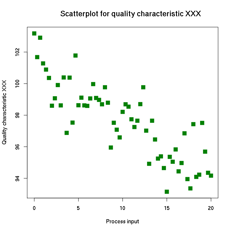
Scatter plots are great visual tools to looking at the relationship between two continuous variables. What you are looking for is how the data points are positioned across the plane/graph. Questions that you asked are for instance:
a. How are the data points distributed in the 2-D plane? Do they form a pattern/line?
b. What kind of relationship between the two continuous variable? Positive or negative? Linear or non-linear (quadratic or cubic)?
c. Are there clusters/groups of them? Are they distinct, far apart from each other or they are quite close? What are the characteristics of these clusters?
No doubt we can use correlation to find out if the two continuous variables have positive or negative relationship but it will never reveal the full details of the relationship without having a look at the scatter plot.
Another advantage of scatter plot is that it allows we humans to digest very large amount of data. Imagine the data that is used to create the above scatter plot has increase by another 5000 observations, and thus we add in another 5000 data points to the above scatter plot. Most of us will still be able to discern if there is a relationship and the kind of relationship the two continuous variables has.
Continuous vs Categorical

To look at the relationship between continuous and categorical variable, we have the box plot to help us with that. Questions that can be asked are:
a. Which category has the highest mean/media?
b. Which category is normally distributed and which is not?
c. Which category has a wider range and distribution?
d. Which category hast outliers?
e. Distribution (left-skewed or right skewed) for each category?
Box plots becomes easier to read and interpret with lots of practice thus for those that started out can be a small hurdle to overcome. The more challenging box plots to read and interpret are those that has many unique categorical values. This is where the box plot gets wider and it can be difficult to make comparison between two categorical values/groups. Suggestion is to use filters to make the box plot “smaller” so that comparison can be made easily.
Conclusion
The purpose of writing these two posts on Exploratory Data Analysis (EDA), non-visual and visual, is to help anyone who is looking to do better on their EDA, so that they can build robust machine learning models that are useful for their organization.
I hope the post has been useful to you. Feedback are welcome too as I look to improve my own EDA process.
Do consider signing for my newsletter, to be updated with what I am doing. Else we can stay in touch on LinkedIn or Twitter. :)