

This post was inspired based on actual events on a fateful day when I was running errands. :)
Together with Eric Sandosham, we teach a visual analytics class in SMU Academy that was very successful. (Side note: we are developing the class further into an Advanced Certificate program on Visual Analytics. Do follow me on LinkedIn if you are interested! Yes, can use SkillsFuture subsidies. -_-) So the class prompted me to be very sensitive to symbols and visuals these days, knowing where the pros and cons of each visuals and what improvements can be made to bring it closer to perfection.
In our class, we are focused on visual analysis, the visual cues and components associated with analysis. This means that in our visual analysis course we look at how the eyes together with the brain 'digest' the presented visuals to come up with insights efffectively and efficiently.
Visual cues are everywhere! Why? Because in order to communicate with language, there is a time period to cater for speaking, receiver decoding and followed by processing. The brain takes a longer time to process language vs visualization. However, poor visual cues are very similar to communicating in language though as it can be misleading and confusing. And it might impact customer experience, if not much thoughts are put into it. Let me share my own experience based on that fateful day of running errands.
Scenario 1: Bold the necessary and important
The previous day, I signed up for a business account phone line with a telco provider. I was in a rush to move to another appointment soon during the application. Per expected, the telco required the business registration form, followed by my identity details. It requested to upload these details in a digital format which I prepared beforehand. The sign-up portal did successfully accepted all the documents and details provided and shared where I can collect the SIM card which I duly noted. During the whole process, I was looking out for anything that is bold and/italics to catch the important details.
Of course something happened! There was a requirement to bring, either digital or physical, business registration form and it needs to be recent, or purchased less than 3 months ago. The best part is during the process, the Customer Svc Officer actually point out to me where the requirement was mentioned, which made me felt bad and I guess was the officer's way of saying that I was dumb not to see it. As you expected, it was 'hidden' among the words and was not bold or italics... Long story short, I thought the collection was going to be 10 minutes long in total given I was collecting it during an early weekdays morning turned out to be close to 40 minutes and not forgetting, for whatever reasons that I cannot come up and fathom, the profile that I bought was buried under to compressed folders. LOL!
If the telco provider had bold and/or italic the requirements, there is a good chance that I would not have missed it and made the necessary preparation. Regardless, it was a bad start to the business relationship and my impression of the telco provider for sure.
Scenario 2: Up or Forward?
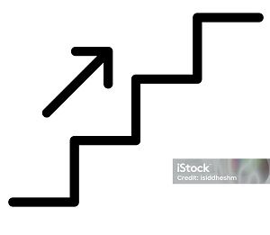
Ask you something, you go to a large facility where there are multiple floors, say a subway station or an airport and you see the sign below. It was placed on top of a walkway with the stairs/escalator on the left side of the sign.
What is your first thought? Upstairs or Forward/In Front?
I interpret this as "In Front". So I keep moving forward but found it pretty strange because I did not see anything that represented the place I want to walk towards to, or another similar sign to indicate that the place is in front. Yes, by now you will have guessed it, I should have taken the stairs on the left instead to reach the place.
The facility management could have used two signs instead. Same symbol but one is placed above and just before the stairs. The other sign, just above the walkway to indicate places that are in front.
Alternatively, I suggest using the above sign "Upward pointing arrow" to indicate in front and the follow sign to indicate the need to go up the stairs to reach the desired place.
Having clear signs is very important especially for areas like airport where people might be rushing to catch their next flight or looking for certain amenities like nursing room, toilets, AED Emergency Kit etc.
Conclusion
While we prefer to communicate in languages, we do face certain constraints in communication like directions in the mall, as it needs to be large so that it can be seen from afar. This is where symbols comes into the picture. However, symbols are also subjected to personal experience and interpretation too.
Through these two scenarios, I actually learned that visual cues are important to customer experience, both online (telco sign-up) and physical (direction in large facilities) as they are part of the visual toolkit business can use to create better experience and in turn increased loyalty, and hopefully more revenue.
What is your thoughts and experience on this? Can share them with me on LinkedIn. If you have similar experience, where you were let down by businesses' lack of visual cues, please share them with me on LinkedIn too!
I mentioned my co-instructor, Eric Sandosham. I will like you to check out his Medium channel, where he writes his thought-provoking ideas on data analytics, data science and artificial intelligence. Definitely worth a read! Check it out here!
Support my work please! Share this article with your network or buy me some "books" to support!